You can view this compressed version of our final piece here (it is better not to open full screen); or better still, watch it on the DVD.
Dancing Pens
Monday, 22 April 2013
FINAL COURSEWORK
You can view this compressed version of our final piece here (it is better not to open full screen); or better still, watch it on the DVD.
Tuesday, 2 April 2013
Evaluation of Appeal to Audience
This is a presentation in which we try to explain what we think our audience will think and feel as they watch our opening. It is intended as a DVD extra but is viewable on here, although the reduced quality because of uploading maximums makes it less pleasant to view like this.
Monday, 25 March 2013
Evaluation of Progress from Prelim Task to Main Task
1. Progress in research and planning
Progress
Progress
Progress from prelim to final was that we were much more skilled with the camera which gave us better camera movements and the choice to use different movements that before we couldn't.
4. Progress in editing
Prelim
Very little editing needed - mostly shot / reverse shot and some matches on action, because that was what was specified in the task. We did our best with this but were held back by the quality of our filming and the lack of context of our task - we didn't know what we wanted the piece to mean so could only focus on continuity editing rather than anything more imaginative.
Final
Much more creative and imaginative editing beyond continuity:
As you can see, our editing is vastly improved as we are now thinking of it as a way of creating meaning for our audience rather than just putting scenes on a timeline and cutting them together.
Prelim
- We did not have a target audience or genre when filming this
- We did very little planning and what we did plan took us 5 minutes
- We did write a short script but changed this just before filming
- we first of all did our task wrong so therefore had to redo this
- we did not relate our techniques to our overall genre/ plan
- we only did not think of what music to put in or what would suit it
- We planned a lot for our final task and put a lot of time and effort into it
- We watched many films that related with our genre so therefore could get ideas from this
- We also saw how they had specifically targeted an age and genre in the opening 2 minutes
- We also noticed common techniques for the genre in terms of camera angles, sounds, editing and mise-en-scene.
- We also added in a contact sheet to start off with so that we could plan out each scene
- This helped us to know exactly what we had to do regarding camera angles, positioning and dialogue
- We also researched the sort of music we had to include that would go with our genre
- We also researched how much dialogue appear in the opening of a Thrillers
- Here are some of the films we researched:
Progress
- This helped us focus on specific components that were important to include in the final task
- This helped make our genre easier to identity
- This helped us know exactly what we were doing when filming as we had planned and researched many ideas
Some examples of our research includes :
http://dancingpensblog.blogspot.co.uk/2012/12/researching-target-audience_5.html
2. Progress in storyboarding and scripting
Prelim
For our prelim task we used 5 minutes of planning just before we filmed drawing up a script, we didn't even make a storyboard. This meant that we where very disorganised and at times didn't know what to do and sometimes forgot what our lines were, making it harder to edit together than it should have been.
When looking for location we just found the first free room. The location wasn't ideal because we didn't have enough room to place the camera and had to resort to balancing it on a table. It also added nothing to our piece and did not set a context.
Final Task
For our final task we made a storyboard and an animatic.
We first put together the storyboard to give us a general overview of the storyline this was changed and drafted many times until we got it perfect.
We then made an animatic using post-its to depict the first 2 minutes. The initial storyboard helped us with it but we still changed and edited the pictures until we were happy with them. The benefits of using the animatic are that we were able to experiment with camera angles and easily plan what dialogue was going where and where the credits could go while staying within our time limit.
Storyboard
2. Progress in storyboarding and scripting
Prelim
For our prelim task we used 5 minutes of planning just before we filmed drawing up a script, we didn't even make a storyboard. This meant that we where very disorganised and at times didn't know what to do and sometimes forgot what our lines were, making it harder to edit together than it should have been.
When looking for location we just found the first free room. The location wasn't ideal because we didn't have enough room to place the camera and had to resort to balancing it on a table. It also added nothing to our piece and did not set a context.
 |
| Poor choice of location |
Final Task
For our final task we made a storyboard and an animatic.
We first put together the storyboard to give us a general overview of the storyline this was changed and drafted many times until we got it perfect.
We then made an animatic using post-its to depict the first 2 minutes. The initial storyboard helped us with it but we still changed and edited the pictures until we were happy with them. The benefits of using the animatic are that we were able to experiment with camera angles and easily plan what dialogue was going where and where the credits could go while staying within our time limit.
Storyboard
Progress
- Made filming a much more smooth operation with less glitches.
- Nobody forgot or didn't know their lines because we had been able to rehearse them.
- Locations were all perfect as we had checked them before.
3. Progress in camera work
Prelim
- Didn't have enough space to place the camera so had very limited angles.
- Didn't fully know how to use camera and recorded over our work a couple of times.
- Had trouble with tripod causing a couple shots to be slanted.
- Had to finish early because we ran out of battery on the camera because we left it on when not filming.
- Had trouble with our panning shot as we had not practiced it.
 |
| Framing here not right for over-the-shoulder shot |
 |
| Match on action with next shot not right - right arm forward here... |
 |
| ... and back in next shot |
Final Task
- Practiced using the camera and tripod resulting in much smoother movements and took out the ones we couldn't do
- Where able to use a wider range of camera angles and movements and ones that would fit in with the movie.

Here we used a panning shot which we practiced many times resulting in a very smooth action.
 |
| We used a tracking shot here which we practised many times because we found it very difficult but thought it would work really well and managed to get a good one on the day down to practice. |
 |
| Extreme close up good choice to convey aggression |
 |
| Better framed shot |
 |
| Interesting angle and good continuity with previous shot |
Progress from prelim to final was that we were much more skilled with the camera which gave us better camera movements and the choice to use different movements that before we couldn't.
4. Progress in editing
Prelim
Very little editing needed - mostly shot / reverse shot and some matches on action, because that was what was specified in the task. We did our best with this but were held back by the quality of our filming and the lack of context of our task - we didn't know what we wanted the piece to mean so could only focus on continuity editing rather than anything more imaginative.
Final
Much more creative and imaginative editing beyond continuity:
 |
| Desaturated to create effect of flashback and echo added to sound |
 |
| Stop motion used to create ident |
 |
| Fade to black to show ellipsis |
 |
| Use of Live Type to create effective title |
 |
| We added sound beneath close ups of Shauna to show where her mind is |
 |
| Cross-dissolve to show transition of mood and location |
Wednesday, 20 March 2013
Evaluate how our product used, developed or challenged the forms and conventions of real media products.
Evaluate how our product used, developed or challenged the forms and conventions of real media products.
Predictions:
Audience feedback made negative or sad predictions about our main character.
Made us feel satisfied as it shows we have created the right emotions for a dark and mysterious thriller movie and made the audience fear for our character.
Title
- Red and white text comes on after the shot with Shauna’s hand scraping against tree, which is our title ‘Red Handed’.
- Fits well as we were trying to add the blood element into the title and this can be recognised.
- Suits the mysterious and scary feel of our genre.
Credits
- They are plain white and simple appear with a slide in effect when the main characters appear.
- We wanted to have simple credits from the moment we began, as our research showed us when adding in credits other thriller films made theirs simple and not over the top
Characters
- Thriller films are always about a young naive female and a strange but intelligent villain that puts in place obstacles and try’s to ruin the lives of the female and her family and friends and sometimes includes another male character that plays the hero.
- Characters used in thriller films are usually involved in some form of social problem, this is mainly the male characters.
- The villain is normaly angry and most commonly has a type of mental disorder which forces them to do these outrageous things and the hero normally has their own inner demons to fight during the course of the movie including having to prove something to themselves or others. We can see from close ups of Cristian that he is angry - the police character does not have time in 2 mins to establish his inner demons.
- Character of female often comes from good background with stable family and friend’s normal very popular and pretty. Also mainly tend to be white female playing this role - this is the case for us.
- Character of male hero consists mainly of a strong well-built handsome male who is intelligent.
- By casting Christian as the villain we in some ways are breaking our genres codes and conventions as we are casting a young teenage male when typically an older male would be cast - however making him young is more chilling in some ways as we wonder how someone of his age became so angry.
- As Shauna is a young niave character which is normally the type of person to play the victim. For example ‘The Hitch’ were Sophie Bush plays the stereotypical young vulnerable girl. youth makes them vulnerable and appealing.
- Our police hero does not appear much but is clearly a likeable character from his close ups and the warm lighting.
Mise-en-scène
- Typically set in working class locations.
- Normally with a miserable feel to it.
- Typically there is also a location such as the police station or interrogation rooms.
- Normally set in dark mysterious locations e.g. alleys, forests, mysterious houses etc.
- Thrillers tend to use unknown casts so people do not make predictions about the end of the film but also so they cannot connect with the character as quickly.
- We used considerable amount of props including knife, gloves, police badge and handcuffs. Mainly to create a dark and dangerous atmosphere.
- Showing these props in the police station showed to the audience that what they are watching is more credible.
- Main location used was the police interrogation room. We moved everything out of this room and only placed two chairs a table and a lamp into this room to make it unwelcoming.
- We wanted to create the feel that it was cold and chilling in this room, which made the main character Shauna still scared and worried. I still do not think we met the conventions of this location as normally they are in a room with not windows however although we did not choose shots that the audience could see the window we still did not meet this convention in our genre.
- The next location we used was a forest of this particular day it was very cold and icy which I think made our piece feel even more scary. I think we met the standards put in place by other films on the typical forest. Although we did not have our main character forcing her way through the leaves, branches, sticks etc. I still think this location worked well. As it seemed it was in the middle of nowhere, which is what we wanted.
- Final location is when Shauna being attacked, seems like a basement which is what we wanted to show.
- The costume for Christian is very stereotypical as he was dressed in complete black and wearing gloves this was to help hide his identity. This is often associated with villains and kidnappers.
- We cast Mr Simpson to be the police detective. He dressed in a typical suit and tie to show he is well respected and of high status.
- Finally Shauna dressed in a very common and distinctive vulnerable way as she wore a white T-Shirt and black leggings. White is nearly always used to show the characters vulnerability.
- We also made rips in her top and added fake blood to it to show she had been attacked and abused this was done to make her character more realistic. As the common conventions for thrillers is that the female character has scruffy and dirty cloths as they have faced horrible conditions.
- At the end of our 2-minute sequence the bloody knife dropped. We did this to keep the audience interested, as they now are not sure what happened and if Shauna really killed her kidnapper/stalker.
- We used many close ups in our film as we wanted the audience to feel emotions and sympathy towards our characters.
- These are typical in thrillers as it gives us time to concentrate and connect with the main character.
- Close ups enable us to make the audience feel the way we want them to feel which is sympathy towards our main character Shauna as close ups of Shauna’s bruised and upset face makes the audience feel for her and want to carry on watching so they know she is going to be ok.
- Also used over the shoulder shots when the interrogation scene is taking place. This is typically used in all different types of genres. It consists of a simple yet effective technique that shows a conversation.
- During the cross cutting shots we used a 360 shot as it was a difficult technique but it worked very well. We were trying to reveal to the audience that we were inside Shauna’s head and were watching her memories.
- We used a high angle shot of when Shauna runs over the bridge and is still running away from her kidnappers.
- We used a tracking shot of when Shauna was running to suggest that this film was going to go at a fast pace.
- There is not really codes and conventions as to what camera angles we could use in thriller films but I think we used a range of angles, which worked well.
- We used quick cross cutting shots so that our film had a fast pace to it
- It is a typical technique in this type of film.
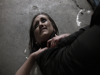
- We made the scenes of Shauna being attacked a bit darker so that it would give the impression it was a more dangerous and terrifying scene. Also it gave the shots more mystery as we were not to sure where they were.
- The main type of music is non-diegetic sound. We chose a mysterious yet fast piece of music which was played throughout the first 2 minutes. To build up tension.
- However the music was lowered when speech was added especially in the interrogation scene, as it seemed there was no music during that scene.
- We used this type of music as it gave the piece as a whole a more chilling and frightening feel to it. It was definitely needed as it helps a lot with building up tension, which is the main premise of a thriller movie. It also gives the audience an indication that this film is going to be very emotional and exhilarating, as so far it has shown very dramatic events.
- The music we chose is very conventional music for this type of genre and I am glad we choose this as although it may not seem original it gives our piece believability.
- We have quite a bit of dialogue in our film. It is most defiantly essential as it helps the audience to feel more sympathy towards the main character but also does not entirely reveal the whole story line but lets the audience themselves think of different outcomes.
- In the dialogue scene the conversation is slow and quite. Which tells us that maybe Shauna is not entirely thinking about the questions Mr Simpson is asking but is thinking about what she done.
- We had to take out a lot of background noise gathered while filming the forest scene as it was right near a main road. This was a good choose as otherwise this scene would not have felt that dramatic and isolated which is what we wanting.
Sunday, 10 March 2013
Evaluate how our product used, developed or challenged the forms and conventions of real media products
Title
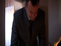
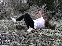
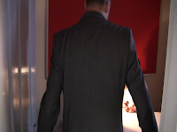
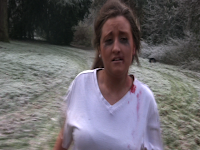
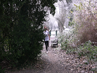
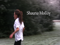
- The first 3 screen shots show the credits and titles. Big bold writing with a sinister looking font for Red Handed.
- Simple titles for the producers and cast fits in with the norm for psychological thrillers we used a float of effect to add a bit more scary feeling. We decided moew muted credits will help the audience take the film more seriously than over the top animation.
- Red colour was used for Red Handed to link in with the film theme with is quite sinister and related to violence.
Characters
- Psychological thrillers tend to cast a young female as the main role and have a stronger man playing the villain we felt we should conform to this generality so choose our characters to fit.
- We also wanted a contrasting male character one being good so we picked an actor who looks like he could be a real detective in real life: quite fit, speaks well showing he is clever.
Mise-en-scène
- We choose a very isolated area to make it seem more threatening.
- Running through a forest is scarier than running though a housing estate. This is because the forest has sense of hidden dangers - hence the popularity of this scene in our genre.
- Typical psychological thrillers have scenes where bad things happen deep in the woods so we were also trying to recreate that.
- Filmed the outside of a real police station to create verisimilitude.
- Very cramped interrogation room use of a lamp to create a typical interrogation situation - this adds a different threat to the main character and contrasts the open outdoor space. Again, movement from outside in is familiar in our genre.
- Abuse scene was filmed in a basement to help set the scene making it seem more run down and sinister - a conventional use of setting.
- Props such as the knife and the fake blood to add extra emphasis to the scene making it seem more real and scary. Police badge helps create his persona.
- Shauna’s costume helps emphasis the fact she has been abused ripped and stains plus make up done to make it look like she’s been cut and been crying adds to the realness and seriousness of her situation.
Camera work
- Beginning starts with a close up to help the audience identify with our main character and so they can figure out that she is the main character.
- Used a 360 shot to show the harm to Shauna’s face and the extended face time helps the audience to sympathise with her as a character. This is a rare camera movement to be used in thrillers but is conventionally used to show disturbance and disorientation.
- We used lots of different camera angles for the abuse scene in hopes to distort the images and hopefully distort the audience’s idea of what’s happening. Extreme close ups are used to keep the identity of the attacker concealed.
- Standard shot-reverse-shot used in interrogation scene commonly used in psychological thrillers so we can see both characters expressions while they talk.
- Tracking shot while she is running this is all shaky and is a similarity to what she would be seeing while running and helps to engage the audience more.
Editing
- We used a lot of short cuts and cross cutting to create a fast paced and dynamic feel to the beginning of the clip very commonly used in psychological thrillers for the action parts.
- Cross cutting between 360 shot and abuse scenes create a contrast between calm and chaos which keeps the audience on their toes.
- We used ellipsis from the police station to help save time and get straight into the interrogation scene.
- Continuity editing is used at police station to show normality returning.
Sound
- We have a soundtrack of non-diegetic music playing underneath half of the clip to help create sad emotions while she is getting abused then during the running scene a heavier thumping track is used to create a tenser atmosphere. Music like this is very common in psychological thrillers and helps set scenes and intensify emotions.
- Dialogue from the detective helps us see that he is trying to help the girl and is kind towards her.
- During the interrogation scene we put screams quietly while the camera was focused on shuna this creates the effect that she is thinking about what happened to her and how awful it was.
- We have not really broken or twisted any conventions in our piece but in the main have stuck firmly to genre conventions in terms of mise-en-scene, plot, sound and character.
- We have also kept to formal conventions (opening sequence) with our editing and use of titles and credits.
- This could be criticised in some ways as not being original or inventive.
- However, I would defend our choices in terms of genre with Dyer's theory that audiences feel 'safe' with genre texts and want to know what they are getting.
- By using familiar genre conventions we have made sure our audience feels right away that they are in for a good thriller with twists and turns and an eerie atmosphere.
- This also makes good commercial sense - as discussed when we thought about our distributor, these are popular films that do well in the box office but not as well as action thriller films. We are not in an economic climate where small institutions can take big risks with quirky, unusual films as it might not pay off.
- It therefore makes sense financially for us to stick with what we know works - which we have done.
Evaluating the use of codes and conventions of my opening 2 minutes
1. Text
- Red text which appears on the tree like blood as the victim runs away slowly dragging her hand across the tree
- Fits in well as the victim has blood all over her hand so it is made to look like the blood from her has smeared on the tree to spell out the title
- Suits the mysterious feel of our genre and creates sense of tension.

2. Credits
- Plain white writing which appears on the tree as the victim runs past from the right side of the screen to the left as we wanted to keep it serious we did not want to use crazy, animated type of credits as the audience may not take us so seriously
- We kept if plain so it was enough to see but not enough to distract the audience from viewing the film - this is the convention in our genre where credits tend to be subtle.

3 & 4. Characters
- Thrillers are usually about a female victim who is in danger and finds herself trying to escape so we have followed conventions here.
- Male characters in thrillers tend to be the person committing a crime. They tend to look rugged and have a bad past - again, we have followed this stereotype.
- Female characters in thrillers tend to be the victim. This is because females are stereotypically seen to be more vulnerable and weak
- Our main character is a teenage girl who is portrayed to be weak and scared
- The use of female victims is common in thrillers. These kinds of characters are seen in most thrillers such as ‘The Town’. This is a movie set in Charlestown about a group of bank robbers who take a women hostage. All of the bank robbers are adult males and the victim (the person taken hostage) is a middle aged female
- The person committing the crime is a young male with a vendetta against the female main character.
- The hero that we have used in our film is a male which helps to give a contrast between the male characters.
- The hero is an older character so that he seems more trusting. People think that older people are wiser so therefore trust them more - this is another genre convention.
- The fact that the hero is a police man helps to trust him more as police are seen to help people in need as it is there job.
5 & 6. Mise-en-scene
- Typically, thrillers are set in a large rural isolated location
- Thrillers often use known actors to promote themselves and to help the audience understand that it is not real, although on the other hand, they cast unknowns so you feel less sure they will survive to the end of the film. Also the victims are usually innocent looking people so that it creates a sense of sympathy towards them.
- The criminals are normally people who are naturally scary looking and are not presented a nice light. They are usually actors that have previously played the same role in other well known thrillers.
- Props such as weapons, knifes, blood and torn clothing help to give a sense of danger and help the audience see the genre of the film. The blood and tears on the victims costume tells the audience that she has been attacked. Our use of props will be familiar to audiences.
- The look on the victims face when running and the manner in which she is running in shows that she is being followed and that she is trying to escape from something or someone. By having only one earring in, and the ear with no earring having blood smeared down it also shows that she has been attacked.
- The main location we used was an isolated forest. We used this because it gave a sense of fear and unawareness. The day we filmed was a cold day therefore making it look more scary as the floor was more white than green from the frost on the grass. Also, spider webs can be seen clearer when covered in ice and snow therefore making the natural environment look more scary and unapproachable.
- The victim was wearing little clothing in what could be seen as a cold environment making her look more vulnerable to not only the male committing the crime but also the place she is in.
- The police officer in image 6 is wearing a suit. This shows that he is important and is a person of power contrasting the villain who is wearing all black rugged clothes (also badge close up- symbol of his authority).
- The police officer is a middle ages man which is the stereotypical view of a police officer. This is why we cast this person.
7 & 8. Camera Work
- We used many close ups in our opening to show the importance of certain characters. We also did this by giving the female main character the most screen time. This shows the audience that she is the person who will be seen the most in the rest of the film.
- The face of the person who committed the crime is not shown in the whole of the opening. Extreme close up used to create impressionistic feel. This is crucial as if they are shown, there will be nothing for the audience to work out and there will be no need to finish watching the end of the film. This is typical of a film in this genre.
- An over the shoulder shot is used in the police station. The camera is behind the female main character looking towards the police officer. This shows the emotions on the policemen’s face showing that he is worried for the girl.
- There is a 360 degree shot surrounding the female main character. This shows the costume and makeup she is wearing telling the audience that she is in danger.
- We used a high angle shot to give a sense that the criminal is watching the victim without her knowing. We did this shot by climbing up a tree and having the camera look down from the tree whilst the victim runs past.
9. Editing
- We overlayed some of the opening shots with a desaturation effect to make hint that these events are not in real time. This also helped cover the criminals face keeping it hidden from the audience. We did this in the editing package (Final Cut Express).
- There is a lot of cross cutting between the victim being attacked and her running from the scene of the crime. This was fast paced and created tension. This lets the audience know that it is an important part of the movie and will be a reference for the rest of the movie. This editing style is a common choice for psychological thriller where the audience needs to feel disorientated.
10. Sound
- Non-diegetic music is used to build up tension and atmosphere when the victim is being attacked
- Dialogue is very little in the two minute opening, the fact that the victim hardly speaks so when she does it is very important. The fact she does not speak shows she is very worked up and scared and what happened and does not want to speak
- The close up of the attacker with him laughing, helps to build up tension as he does it in a very aggressive way which puts the audience at the edge of their seats
- The use of echos from the past in the victim’s head in the police room is used to show that the victim is scared about what happened and cannot forget about it - this distortion of sound fits with the idea of mental distortion and so helps create the genre tone.
- The loud screaming used by the victim in the flash backs are used to show the audience that the attacker is hurting her and that he is actually attacking her so they know who is good and bad in this situation
Subscribe to:
Comments (Atom)


